Are you losing readers from your website? Are you left scratching your head thinking what is causing this? There can be a number of different reasons as to what is causing this (no SEO, poor content, no social media interaction, etc.) but there is one thing that many sites fail to look at, and that is Typography!
Content is by far the most important aspect of a blog, as it is this that will attract the traffic to your site. That said, if people can’t read your content properly due to poor site typography, then they won’t stick around for long.
By definition: Typography is the art and technique of arranging type in order to make language visible. – Typogrpahy From Wikipedia
Typography is a significant aspect of contemporary web design especially for those working with CSS. Here are some design tips that you can use to help improve your website readability.
Top Typography Tips
The Grid System
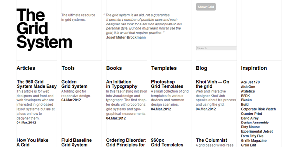
If your design elements and text are all over the place on your pages, it can becomes difficult for the reader to follow the page correctly. It just looks messy. You can use a CSS grid system for your site to ensure that your content is all organized into neat columns and grids.
This makes directing the visitors to all the key elements on your page much easier. An example of a popular grid systems that you can use is 960.gs which can be used when designing your website.
Colour Contrast
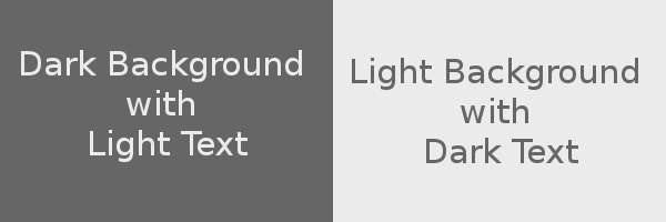
While grid system and layout are all important, so are the colours that you use. Using a light text on a light background or dark text on a dark background will never work. This will just make things very difficult to read, if not completely unreadable.
You are much better sticking to using either;
- Dark Background with Light Text
- Light Background with Dark Text
These keep things simple and make sure that your text is easy to read.
An interesting point to add is that if your target audience are people over 50, they will tend to prefer darker text on a light background as they find it easier to read. The contrast in colour also plays an important role. For instance, if your site has a black background, make the elements bright to draw the attention of the readers (i.e. dark blue may not work so well).
Visual Hierarchy
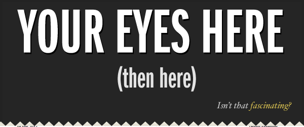
Visual hierarchy is the process of guiding your readers through your article and getting them to notice the different aspects that you want them to see.
Every article will include; large paragraphs, small paragraphs, titles, subtitles, quotes, images, etc. which become reference points for your readers when reading through a post. Factor in the use of different colours, fonts and various other elements and you begin to create a visually interesting article that naturally draws the eye of your readers. Which leads nicely to our next point…
Using The Right Font
In order to present your writing in the best way possible, you need to choose the right font. The font you use is arguably THE most important design element on your site, as it is your text that will be read the most.
You may be tempted to use a snazzy or unusual font type, but in most cases you are better off sticking to something simple. Use stylish fonts for other visual elements, but keep your articles easy to read. Remember that what is important is how they look inside your text.
Keep Text Short and To The Point
It’s fairly well known that when people visit your website, they don’t generally read an article word for word, they simply scan through it. Therefore, by breaking up your posts into short and to the point paragraphs helps to improve readability. This links in well with ‘Visual Hierarchy’ as it helps to draw the eye of the reader and keep them interested.
Use bullet points, quotes, statistics etc. to break up big chunks of text and make sure to check over your post before your publish it to remove any “superfluous” words and sentences that aren’t necessary.
Incorporating some of these tips into your website design can help to engage your visitors and allow them to interact with your website more.
What about you? What design tips do you use to improve readability? Which design elements do you really like/dislike on sites that you have seen? Please let us know by leaving a comment below!
CommentLuv vs Disqus – Why I Don’t Use CommentLuv!