For the past year, more and more web design trends have geared toward a more minimalist approach, with more images neatly lined up, smaller texts underneath the images, and generally a cleaner solid-coloured backdrop. On top of that, there is also the concept of cover photos, popularized by Facebook’s Timeline mode.
Upon entering a website, it takes time for a user to figure out exactly what kind of information he or she needs. Which is why nowadays, websites will have more images laid out on the home page, because while a picture is worth a thousand words, the picture by itself is much easier to take in rather than a lengthy word description. From that point, the user can gradually move forward and narrow down the choices to find what he or she is looking for.
Web users’ needs are constantly changing, there is no stop or pause in terms of trending for websites. So what are the next web design trends for 2013?
Web Design Trends 2013
1. Responsive Web Design
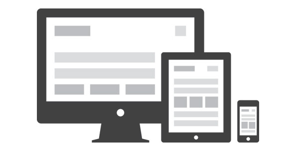
OK, so the truth is, this really has been going on for a while, but still, there are lots of websites not attuned to this. The idea of responsive web design is to make the website viewable and appealing across different kinds of devices (i.e. desktops, laptops, tablets, and phones).
To go back a few years, we know that very few sites, if none at all, can be viewed properly through mobile devices, which frustrates mobile users who have internet access. At times, some websites may provide a mobile template, which, while more compatible, is not as appealing as the original template that can be viewed through the computer. Having a responsive web design will encourage users to access site more frequently, plus web designers won’t have to make several templates for just one website. So to continue this trend, designers have to consider two things: changes in resolution and in orientation (portrait or landscape).

2. Parallax Scrolling
At this point, parallax scrolling has a more aesthetic function over anything else. The idea here is to make the objects on websites, which are obviously 2D, appear 3D by adding layers and making scrolling speeds different for each layer (ex. the topmost layer may move faster when cursor is pointed at it, while the 2nd or 3rd layer drifts across the screen slowly).
Parallax scrolling is most often seen in video games, but the concept is now being incorporated by some websites, and will most likely be seen in sites designing e-cards or online invitations for events.
3. Retina/HiDPI Optimised Websites
Today, everything has to be in high definition/resolution – TV screens, monitors, cameras, movies, pictures, etc. Again, another aesthetic option for websites but is important in engaging web users. Nowadays, people spend so much time online, it is natural for them to demand to see things bigger and better. And speaking of bigger…
4. Bigger Call To Actions

Most sites are also becoming more sensitive to making buttons and links more visible. One thing that frustrates users is when they are instructed to click on a particular link or button, they sometimes end up having to look all over the site, trying to locate it. Apart from the visual appeal, having bigger buttons would save time as well as users won’t have to squint their eyes to read properly.
5. Tailoring the Site to the Brand
All the web design trends may seem appealing, but it is important to remember the brand. As marketing people might often say, “Brand is the king”. So designers must make sure that in the process of creating a site, the design must be in line with the image of the brand.
Maximize the trends that are more suitable to the image, and take into consideration what users are really looking for in your site, as well as when and where they are most likely to visit your site.
And there you have it. Whether as users or designers, remember that while new trends are attractive, it doesn’t mean that all of them put together on one site will have the same appeal. So be sure when you implement a design or give feedback on a site, keep in mind the most important features that make your site navigation experience a smoother one.
What do you think? What web design trends do you think will be popular in 2013? Which web design trends do you like or dislike? Let us know by leaving a comment below!

CommentLuv vs Disqus – Why I Don’t Use CommentLuv!