We have talked a lot about different elements of web design here on the site, but one thing we haven’t looked at is colour theory. There are many different aspects that go into creating a great looking website, but the colours you use has, arguably, the biggest impact.
In this article we will be looking at, not only what colour theory is, but how you can go about choosing the right colours for your website.
What Is Colour Theory?
Colour theory is a term used to describe the proper way to pick colour combinations that complement/contrast each other and work well together visually. This is particularly useful when choosing colours to use for web design, or in fact any kind of visual design.
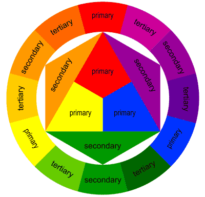
To understand this we need to first take a look at a colour wheel.
This colour wheel can be categorised into three different groups;
- Primary colours (red, yellow and blue),
- Secondary colours (orange, purple and green),
- Tertiary colours (red-orange, yellow-green, blue-purple, etc.)
The colour wheel is split up like this as it helps to understand how colour works. The Primary colours are the main colours that make up all the Secondary colours of the spectrum when mixed. To get the Tertiary colours, simply mix together a primary and secondary colour.
I’m sure most of you will have learned about this back in school, but this is taken to another level within colour theory when we start to look at the 6 different relationships between colours. This is important when choosing colours for your site.
1. Mono Colour Scheme
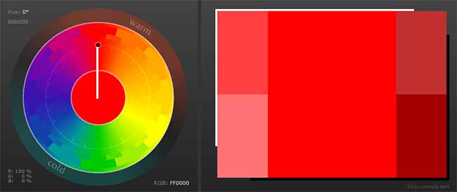
A mono colour scheme is where you choose a base colour and select similar colours, based on different shades and brightness to complement each other.
2. Complimentary Colour Scheme
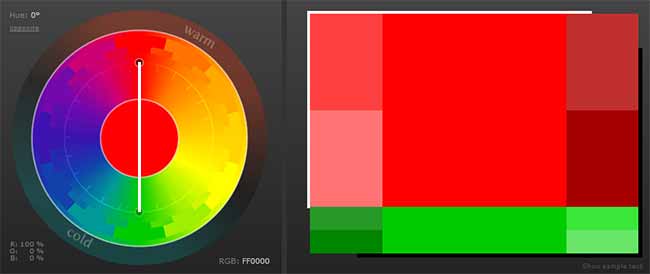
A complimentary colour scheme is where you choose a base colour and then select the exact opposite colour on the colour wheel to go with it. This is a very easy way to select colours for your site as opposites on the colour wheel work very well together.
3. Triadic Colour Scheme
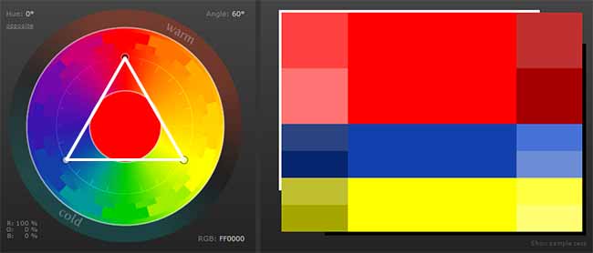
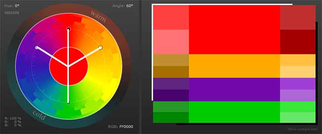
A triadic colour scheme is where you pick 3 colours from the colour wheel by drawing a triangle out from your base colour. This allows you to select a main colour and two complimentary colours that go well with it.
4. Tetradic Colour Scheme
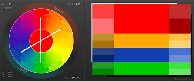
A tetradic colour scheme is where you select two colours from the colour wheel that are fairly close together and then the two opposite complimentary colours. This gives you a bit more freedom in your design than the complimentary colour scheme does.
5. Analogous Colour Scheme
An analogous colour scheme is based on 3 colours that are (more or less) next to one another on the colour wheel. This means that they all work well with one another without too much of a contrast.
6. Accented Analogous Colour Scheme
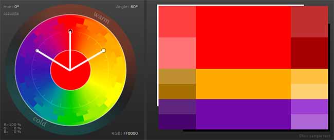
Finally, an accented analogous colour scheme is basically just the same as an analogous scheme, only with one complimentary colour from the opposite side of the colour wheel added. This just allows you to include a contrasting colour to help draw attention to certain aspects.
Picking Your Website Colour Scheme
It doesn’t really matter which of the above types of colour schemes you use, only that you use one of them. Choosing your colours in one of these ways just helps to make everything look that bit better than simply randomly picking colours at will.
Seeing as though there are so many different web colours to choose from, there is an online tool that can help you. The ‘Color Scheme Designer 3’ will let you easily flick between the 6 different scheme types to choose the one that best fits you. Simply pick your main colour (by dragging around the colour wheel) and the tool will help you with the rest. The great thing about this is that it gives you the specific RGB value for each colour, making it easy for you to add that in to your HTML theme settings.


CommentLuv vs Disqus – Why I Don’t Use CommentLuv!