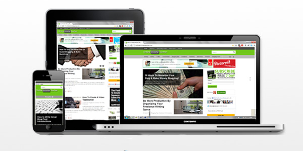
As you can see, I’ve been pretty busy working on a new look for the site. I wanted to tidy up the old layout and freshen it up for all of you. Nothing like a good clear out now and again to tidy up!
The main point of the blog redesign, apart from making the site look nicer, was to make it more functional and accessible for mobile devices. More and more people are logging online via their smart phones and tablets whilst on the go. That makes it vital for websites to be mobile friendly; otherwise your visitors might end up not being able to access your site. That certainly would be bad for business.
Thankfully, WooThemes released an updated version of the Canvas theme that I’m using that enables it to work on all devices with ease. I just needed to make sure everything was set up properly.
Homepage
At first glance, there doesn’t seem to be much many noticeable differences from the old design. I wanted to keep the general style of the homepage, especially the picture slider that I quite like.
Header
I did begin by making the logo and header smaller. This was because I felt that previously this was taking up far too much space that wasn’t necessary. I also added a search bar, which is visible on every page. Hopefully this makes it much easier for people to find posts that they were looking for and, from my perspective, keep people on the site a bit longer.

Menu & Navigation
I added a few more categories to the main navigation bar and some links in the top menu. Again, this is supposed to make it easier for visitors to find what they are looking for. I spent quite a bit of time working on this, which I’ll talk about below.
Advert Bar
I think the most notable addition is the inclusion of the advert bar at the top of the page. Previously, I’d been displaying a smaller ad next to the site logo, but I always thought this looked a bit untidy and anyway I needed to make room for the search bar.
I decided to place the advert bar underneath the header for a couple of reasons. Firstly, from a business point of view, that space is highly visible and much more likely to be clicked on. Secondly, I thought that it would be better to place them above the content, rather than place ads within posts like some bloggers choose to do.
Due to the default size of the advert (728×90), I worked out that I’d have had large wasted space either end had I placed it on its own in the middle of the page. That’s when I decide to turn that wasted space into something that I could use and create a small custom ad space for the site. This small (227×90) ad will be reserved to display site content only, which is why it’s currently showing links to our social media pages that I designed. In the future I can use this small, yet highly visible space to advertise my own eBook (when I finally finish it), or any future products or services that I create.
For those of you interested how I got the custom images to cycle between one another whilst linking to the separate pages, I used this ‘Free JavaScript Ad Rotator Tool’ that I found online. It’s really easy to use and then you just have to copy & paste the code where you want it. You can tweak the settings to adjust the speed of the images switching between one another. I still need to decide whether to slow down mine. What do you think?
Subscribe Box
I also added an AWeber ‘subscribe’ box in my sidebar to make it as easy as possible for people to subscribe to the OnlineIncomeTeacher weekly newsletter (every Thursday) and free 7 day eCourse.
I also added one to the bottom of every post. This was pretty easy to do, as WooThemes makes it easy to include content in certain sections of the theme using their inbuilt ‘Hook Manager’. That said, I still had to go back and remove each and every one of the previous subscribe boxes that I had manually placed at the end of EVERY post on the site (I didn’t know about the Hook Manager until recently). I was up till 6am this morning removing them all!

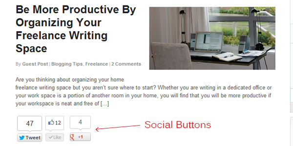
I decided a while back that when I came to redesign the site, I wanted to include social media buttons to the home page and category pages. These way, not only are all the posts more likely to be shared, but it gives a better representation of how popular a post is. I found that some posts were being shared quite a lot, yet weren’t getting many comments.
I used the ‘Digg Digg’ WordPress plugin to do this and I have also switched to using this for my floating social buttons on each post.
Having the social media counts next to each post just helps to give a better indication of how people are reacting to posts. The idea is that it will encourage people to click onto and read more of our posts. That’s the idea anyway! Seems to work for other sites though.
Daily Poll
A brand new feature to the site is the ‘Daily Poll’ that I have decided to introduce. I’ve seen other types of sites use this successfully, but not many blogging sites. The idea between this is that it adds an interactive element for visitors to engage with and feel part of the site. By making it a ‘daily’ poll, hopefully this encourages people to keep revisiting the site to see what the question of the day is.
I’m using the ’WP Polls’ plugin to manage this new feature. I’ve used it before on some of my other sites and it works pretty well.
Again, that’s the method behind the madness. I’ll have to see whether it works or not!
Re-Structuring Of Site
As I mentioned above, I added some extra categories to the main menu. I had started to feel a bit restricted by the categories that we were using to identify each post. As the site has grown over the last year, we have diversified the type of content that we have been publishing.
I also went back and looked at all our previous posts to see what other categories they would fall under. I had been using only one category per post, but that had become far too limiting, so I went back and re-categorized everything! This led to many posts being included in numerous different categories.
Hopefully, this will help people to find more of our content. Some people may have only been interested in, for example, our writing posts. But some of our old ‘blogging tips’ posts have now been added where appropriate.
So that is pretty much it as far as the redesign goes. It sounds a lot more straight forward that it actually was. I’ve spent a lot of time reading and learning about coding and HTML during this process. I feel a lot more confident about web design, though I’d still class myself as a novice. I certainly couldn’t create a theme from scratch!
Anyway, I hope you found this post and more importantly the new site useful. Let me know, good or bad, what you think of the new look to the site in the comments below and don’t forget to take part in our daily poll.

CommentLuv vs Disqus – Why I Don’t Use CommentLuv!