Web design is something that many people only think about when first setting up their site online. They may spend hours, days or even weeks pondering over the best placement of a logo, or what colours go well together. Whatever it may be, once a site owner is happy with the way the site looks it is often forgotten about. Due to this, there are many sites online that have bad web design features that are putting many people off from revisiting their site.
Running your own website is a rather “unique” experience. There is often a lot more that goes into it than people originally think, which is one of the reasons why so many people give up prematurely. When you are not thinking about what your next post will be about, you will be promoting yourself on social media, looking at more ways to monetize your site, replying to endless emails, creating your own product, etc. etc. etc. Web design is something that is always put on hold until later. Unfortunately, a sites web design has a much bigger impact on people than you may think.
We have put together a list of 7 “no-nos” of bad web design to avoid.
1. Website Text
You may think web design is all about graphics, colours, pixels, etc. but text is a key part of it that is always overlooked. Text makes up the majority of your site, which is why it is so important that it is presented well on your site.
Some common examples of bad text on a website would include;
- Small text that is difficult to read,
- Illegible fonts (i.e. fonts that look handwritten),
- Text that appears crowded together,
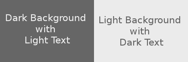
- Text colour contrast makes it difficult to read,
- Underlined text that is not a link,
- Coloured text that is not a link,
- Paragraphs in all caps/bold/italic.
If people find it difficult to read the content on your site then they won’t stick around for long. Always, always, always put emphasis on clear and easy to read text on your website.
2. Bad Website Navigation
One thing that really gets on people’s nerves is bad website navigation. It is infuriating when you are trying to find something on a site but can’t due to;
- Poor navigation,
- Unclear navigation,
- Complicated (and unnecessary) navigation,
- Broken links,
- Pages/post titles that don’t properly explain what they are about,
- Endless scrolling,
- No search bar,
The whole point of creating content for your site is to enable people to find it. If they can’t, for whatever reason, they will go and find it elsewhere.
Every couple of weeks (or so), have a play around on your website and see if you can find everything. Better yet, get a friend or family member to test your site for you and see how easy they find your site to use. Don’t take any criticism to heart; just use it as a way to improve your site further.
3. Bad Overall Design
There are certain web design features that scream out to be fixed, yet for whatever reason, some website owners choose to ignore them. These not only annoy potential visitors to your site, but they also could be limiting how many people can actually find you.
Some of these overall bad web design features would include;
- Websites that don’t work (or have major issues) on certain browsers,
- Websites that don’t work or appear incorrectly on mobile/tablet devices,
- Excessive use of frames,
- Side scrolling,
Mobile and tablet internet browsing has exploded in recent years (and is set to increase further) so it is incredibly important that you make sure that your site is “mobile friendly”. Failure to do so only limits the number of people that can potentially find you online.
4. Website Backgrounds
Website backgrounds are something of a divisive subject in certain circles. Some people love them whereas others absolutely hate them. Whichever stance you take, there is unquestionably a wrong way to go about using them. This includes;
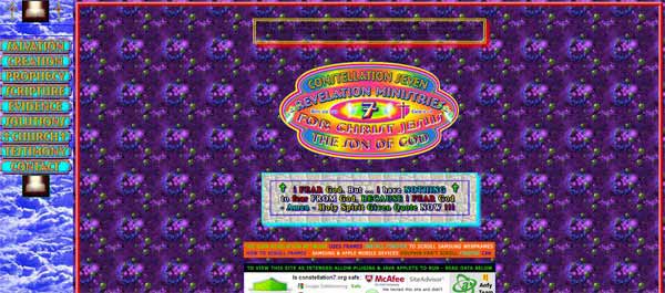
- Busy, distracting web backgrounds that take the attention away from the content,
- Backgrounds used under text that make it hard/impossible to read,
- Backgrounds that make you dizzy and want to vomit (like the above picture).
Backgrounds can, when used properly, be a great design addition to a site. Anything, however, that distracts or makes it harder for the viewer to read should be avoided.
5. Website Links
Every site has links, yet some sites choose to make these links difficult for their readers to see/follow. Why they would do this is anyone’s guess, but it sure won’t impress many of your visitors.
Try to avoid;
- Dead and broken links,
- Links that aren’t easy to see due to a low contrast in colour,
- Links that are the same colour as your text (how will people find them!),
- Undescriptive links,
Just make things easy for people by making your links as clear as possible.
6. Images
Images, when not used correctly, can cause more problems than you would expect. The biggest factor is when people use images that are really large (both in terms of dimensions and file size) that cause your site to load much slower.
- Large images that take a long time to load,
- Images that are bigger than the users screen,
- Images with no Alt tags,
- Large (file size) thumbnail images,
There are many things that you can do to help improve your page load speed, but one key aspect is to use properly optimized images. Doing something as simple as this can improve your site speed greatly.
7. Useless Website Junk & Clutter
To wrap up this list I wanted to quickly talk about the clutter and general junk content that many sites feel the need to include. I’m talking about things like;
- Excessive amount of adverts,
- Meaningless awards mentioned on every page (who cares you were voted best local website in 1998?)
- Pageview counters,
- Too many links in the sidebar,
- Anything that flashes or blinks,
- Automatic video/audio that starts when you open a page,
If you bombard your visitors with too many things when they land on one of your pages, it can get distracting and/or put people off. Remember that it is your main content that will keep people on your site, so don’t try to distract their attention away from it. Of course, there will be certain things that you will want to highlight on your site, but having too many of them can have an adverse effect. Less is always more in this regard.
How Many Bad Web Design Features Do You Have?
These are just a select few web design features that you can work on. Ultimately, in order to create a good site you need to think like one of your readers. Can you find things easily? Does everything work? How fast is my site to load? What things attract/distract my attention? Answer these questions and you will be on the path to create a much better website.
If you are still unsure, checkout what not to do by visiting “what has been described as” the world’s worst website!
Always remember though that web design is an ongoing process. Technology is always changing and it is your job to make sure that your site is always up-to-date and working correctly. Standing still is never a good option, always be looking to evolve, develop, improve and move forward.
Which web design features do you think you could improve upon? Which features would you add to this list? We want to hear from you, so please leave a comment below.


CommentLuv vs Disqus – Why I Don’t Use CommentLuv!