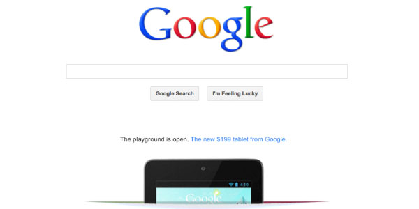
The stark-white surface of Google’s anchor page is no longer pristine. Who dared violate this virginal space? Apparently, the only suitor good enough to advertise on Google’s homepage is Google itself. They took advantage by inserting an ad for their new tablet device, Nexus. It is the largest piece of advertising to go on Google’s homepage. If they turn this prestigious position over to the mere mortals of marketing, what would the right ad look like?
Advertise On Google’s Homepage
Ruined!
Google has gone from being the little spider engine that could to one of the most-viewed websites in the world. They are a giant, but a relatively unassuming one when it comes to their personal design. The homepage has remained untainted with the spoils of commerce all these years, aside from a few delicately placed product placements that include a 2009 link to the Droid from Motorola and Verizon Wireless and its own promotion of the Nexus One phone a few months later. For a company widely known for their Internet advertising, Google has, oddly enough, for the most part left their homepage alone – until now.
Simple Yet Classy
A slice opens in the white background and the new Nexus 7 tablet glides upwards, symbolically giving birth to its new bouncing little baby. The design, including the tantalizing playground tease, makes you want to click, and that is the point. Any ad going on a stark white background should have clean lines and just enough colour to make it pop. Too much dazzle will feel cheap. If you look at the image of Nexus, the slit cut into the floor has just a little bit of colour to give it texture, but not glitz or glittery sparkle. Clean, simple lines give the image realism. You feel like you could reach up and grab one, “I’ll have that, thank you.”
Think of the traffic jam that would cause. You could use the same advertising techniques for email marketing to create a multi-channel campaign. If your business does choose to improve outreach and marketing strategies, email providers such as JangoMail will help get you on the right path. These types of service providers are usually easy-to-use and can be effective in developing an email marketing plan, as long as you have a good idea ready to use.
Powerful But Just a Tease
Too much information kills the mood just as quickly. Look at the Nexus ad, Google offers enough to get your attention without being overly friendly. This is a click-through ad; it does little good if the viewer does not click through. Give them too much up front information, and you take away any reason to click. As Mom would say “Why buy the cow when the milk is free?” Google makes you buy the cow to get a closer look at Nexus. The viewers get just enough to make their mouths water; to make them want to know more about this little secret they are the first to know about.
The Nexus is affordable. Google makes that the draw. The only thing you know when you see the ad is that this tablet computer from Google costs $199. If you want more, like features for instance, you have to click. Now their “baby” just became your “baby.” Welcome to the wonderful world of stealth advertising.
Powerful But Not Too Lean
The flip side of the draw-them-in coin is giving enough information to get the click. The advertising gurus at Google know that too little of a tease will kill the click possibilities, as well. It is a balancing act to find the right text to sync with the image. This world is a visual one — which means the graphic is the most important thing in the ad — but once the viewer stops looking at the pretty picture, you need to entice them with just a few sweet words. Remember, you are welcoming a baby into the world. If the ad just looks good, but doesn’t have a personality, well, that gets boring fast.
With the right ad on Google’s homepage, you would be king. You might just have to find a completely new email marketing client to handle the traffic increase on your business site. An estimated 183 million people land on Google’s homepage each month, according to gizmodo.com. That is bound to cause a ripple.


CommentLuv vs Disqus – Why I Don’t Use CommentLuv!