Getting to the top of a Google search page can set your website up for a large quantity of traffic, but what good will that do you in the event that each visitor only spends a few seconds on the site before leaving? Once you have a page that is popular, you want to ensure you have a page that retains its visitors: the average stay on a single web page is just over a mere thirty seconds. Keeping visitors on the site for longer increases click rates, social media shares, and your page’s notoriety. Here are three ways to keep viewers on your site for longer.
3 Ways To Keep Viewers On Your Site
Make It Pop
Red cars get more speeding tickets than other colour cars, not because their owners drive recklessly, but because the colour red hits our eyes first.
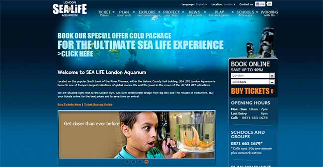
Just as police spend more time giving tickets to red cars, so too does the colour of your web page affect how the information reaches a visitor’s perception. Strong colouration will be necessary to give pages an effective accent. This colouration may be obvious at times (For example: a webpage about aquariums should always be blue, full stop) but other times you may have to analyse what value a colour adds or subtracts.
The same is true with graphics. A graphic can cause text to resonate, but it also interrupts a visitor’s attention, meaning that it may distract a visitor and even send them away. Always use graphics that have high relevancy to your site’s content and leave no ambiguity, lest a picture send a visitor off to Wikipedia because they did not learn what they wanted to know.
Here is an example of an aquarium home page:
Text: More Is Less
When you put a PowerPoint presentation together, do you focus on huge chunks of text or single slices of information?
Few people enjoy being lectured, but nearly everyone likes to be part of a brisk conversation. Design a website that addresses the attention span of the Internet generation by putting less detail instead of more. Four out of five web users will scan a site rather than read it, looking for key phrases or just a few words to get the jist of an entire page.
You can find ways to adapt your writing style to this type of attention span, like:
- Frequent line breaks
- Subheadings
- Bullet lists (like this one)
- Captions on every image
More tips on creating text for rapid-fire page viewing can be found at copyblogger.com/scannable-content.
The Experience Of Creating A Memory
Psychologists with clipboards and white lab coats have concluded that people’s short term memory lasts as little as thirty seconds and can only involve four or five specific points. It is crucial that you embed your page in a visitor’s long-term memory, since our short term memory is little more than a sieve.
How can you best accomplish this?
Make sure that the user has an experience on the site that triggers an emotion. This emotion can be the surprise of an unexpected result, the achievement of completing a task, or the pleasure in watching a puppy at play. Never be satisfied with your site as a finished product: instead, keep adding new pages, displays, and interactive components that are designed to trigger emotion. This should be done on every page but especially your landing pages, since it is the first part of the site a user will see and the landing page’s viewership usually strongly influences search results.
Test out new additions with A/B split testing or multivariate testing, a means of using existing content against new or modified content to see which gets more positive results and viewing time. For more information on how to get a better user experience, check out this post over at www.adaptiveconsultancy.com.
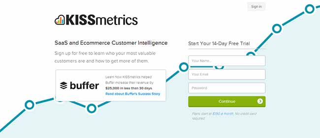
KISSmetrics are a great reference if you are looking for a perfect landing page – their call to action is clear, their logo stands out AND there isn’t much going on to overwhelm the visitor.
Here is their landing page:
The Final Word
When your page needs a shot in the arm in order to boost its viewer retention times, you need not necessarily change up your links or delete entire paragraphs of text. Instead, model the page as a comprehensive experience that makes the individual want to become engaged with its features. Visual imagery along with brevity and an emotional trigger can help keep viewers on your site for longer.
What tips & tricks do you use to keep viewers on your site for longer? What methods have you seen that work well? Please let us know in the comment section below.


CommentLuv vs Disqus – Why I Don’t Use CommentLuv!