Readability does not just refer to legibility!
When it comes to the websites, readability goes beyond simply making it easy for the reader to read your content. On the internet, it’s more about getting your content to the right people and making sure they read what you want them to read.
How do you accomplish this task? Of course navigation, toolbars, sidebars, placing of content and various factors are all important, but fonts help to display your writing in different ways and add charm to your content.
1. Use Fonts Wisely
People often form opinions of a website in a few seconds when simply looking at it for the first time. The fonts that you use throughout your site are a big factor to this, as fonts display all your text on your site. Research has shown that the general reader skims through the majority of text and if your fonts are hard to read, they are going to struggle through it thinking that the content is too difficult to get past. In a special survey, it was noted that people can take up to twice as long (that’s a 100% increase in time!) to read content that is too decorative.
So, it all depends on what impression we want to create. If you want the user to make a purchase on your site and you want them to know of a great deal that you are offering – then the best way to convey this would be through simple fonts. On the other hand, if you are selling something exquisite and exclusive, using creative and styled fonts is a great idea because it makes the user perceive your product as something that’s hard to get or find. The fonts, in this case, can increase the value of your product.
So, it’s important to make a wise choice about the selection of fonts. In the majority of cases, just keep it simple!
2. Keep Fonts Simple
That brings us to the point about ‘font simplicity‘. This only goes to say that the most legible fonts are the ones that work most effectively. Our own handwriting styles are often simple and influenced by the way the mind is trained to read. Hence, although a cursive style is appreciated and accepted, it’s needed to keep the curves simple and less strenuous on the eyes.
3. Keep Font Colours Soothing
Humans, over time, have been accustomed to read in a particular manner. That is; school black boards and white boards, newspapers, novels, etc. They use a fixed pattern of either; a dark background with white fonts or light background with black fonts. This is because it’s easy for our brains to distinguish between the contrast of dark & light or black & white. Somewhere down the line, this pattern has to be followed because that’s how our minds work.
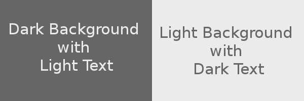
Now, if we extrapolate this and look at website design, this contrast is needed to make reading easier for your site visitors. A black background with white fonts can work well, but is often overlooked for large quantities of text for a more professional looking light background with dark fonts. Besides, isn’t that the easier way to read?
4. Highlight specifics
The idea behind emphasizing highlights is that it’s a great way to make a point.
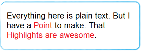
By making simple points stand out or highlighting words, you are laying importance on them. You can also make internal links and external links stand out within your text by using a bold colour.

The highlights again, don’t have to be colour changes. They can be subtle with italics or with a bold effect. Coincidentally, using bold and italic text within your writing can improve your on-page SEO!
The point is, to make a Point.
5. Jump out of the margins!
Jumping the margins is something like breaking the rules slightly. And what do we achieve by that? Take a look at this image.
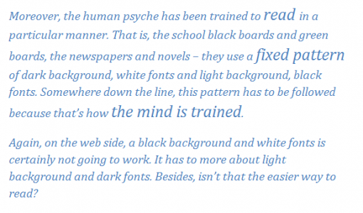
Don’t the words which are slightly different from the others, catch your attention?
This is the special use of jumping margins. This can also be done as below. Take a look at the image:
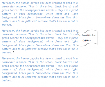
As seen here, the small call-out box popping out of the margin is sure to catch attention and get a few clicks.
Hence, keeping these few points in mind, and making the most of the fonts on your website, you should be able to improve your website design and win people over!
But what do you think? Do you pay much attention to the fonts that you use on your website? Do you prefer a dark background with light text or light background with dark text? Let us know your opinions by leaving a comment below!
___________________________________________________________________
Thank you to my Guest Post Author: Divya Rawat
Divya is a passionate blogger who writes on website design and e-commerce. She also has experience in backlink building, SEO and SMO planning and implementation.
___________________________________________________________________

CommentLuv vs Disqus – Why I Don’t Use CommentLuv!